
I enjoy doing Packaging Design. It challenges me as a graphic designer, even if it is a small label or a pack design for a well known consumer durable. Packaging also happens to be my first introduction to design as a professional. Most advertising agencies in the early 90's- when I began my career, started their trainee visualisers on Packaging Design! It is therefore, my first love. My first artwork that went into print was for a Monginis Cake pack...sadly have no record of it.
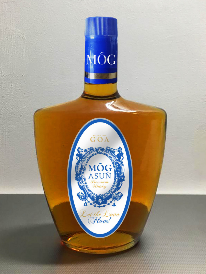
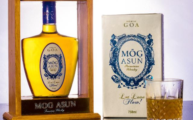
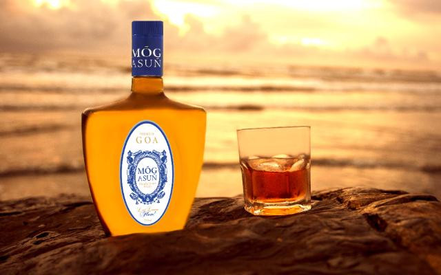
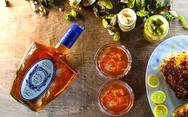
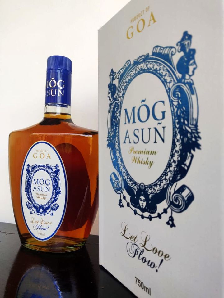
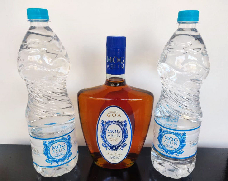
Mog Asun Whisky
I did this packaging for a Goan Whisky brand. It is inspired by Azulejos tile patterns and name plates. The name means 'Let there be Love' or 'Let love remain' in Konkani. It's a commonly used greeting in Goa when people bid adieu to each other. The products shots are by Syedz Photography, Porvorim Goa.
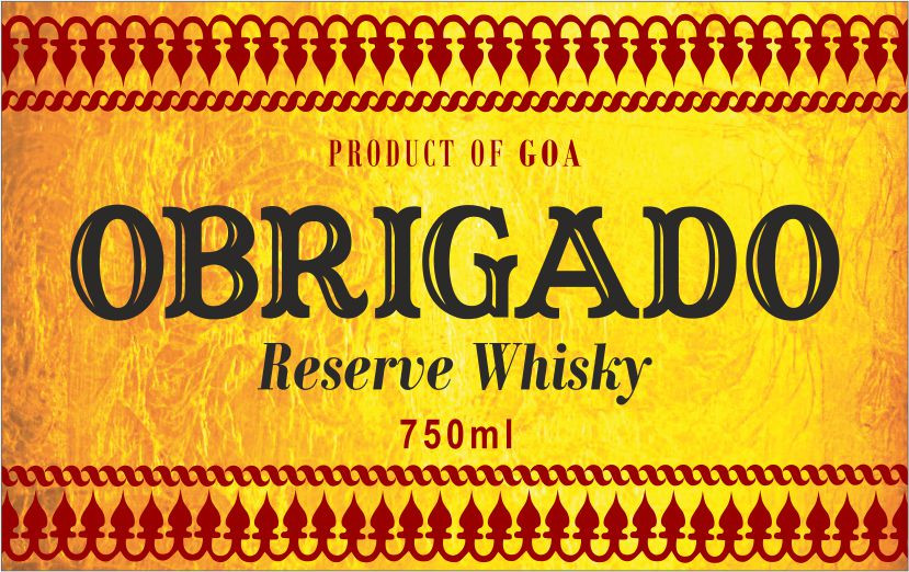
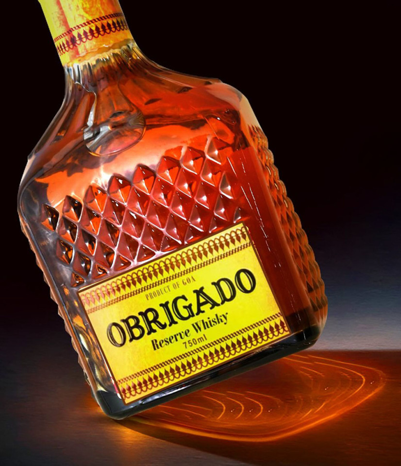
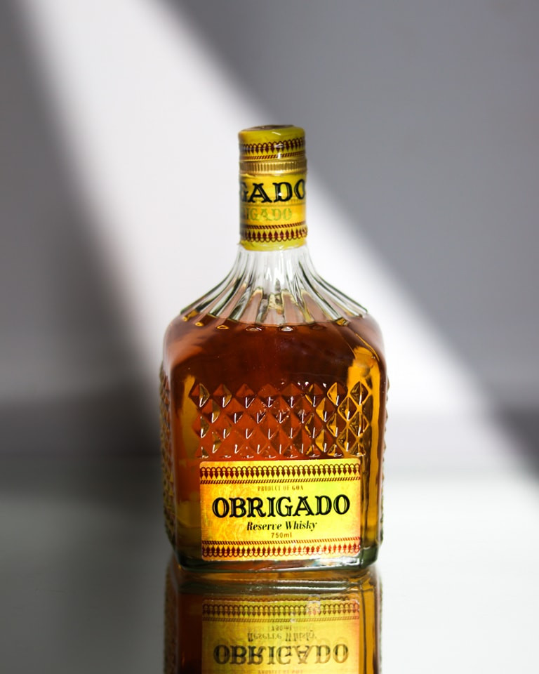
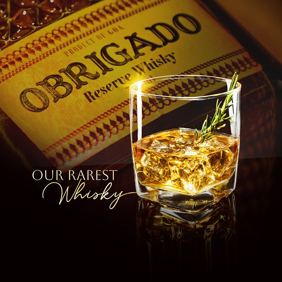
Obrigado Whisky
This is another label design for the same company that does Mog Asun. Obrigado whisky is for markets outside Goa. Obrigado means thank you in Portuguese. I have used a Kaavi Art motif for this label for a fusion of east and west.
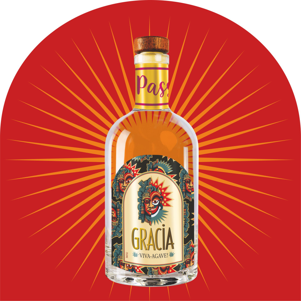
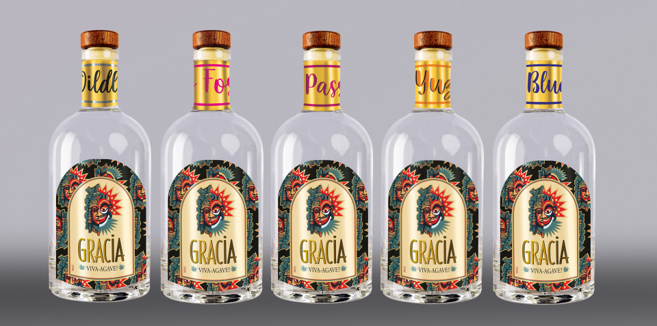
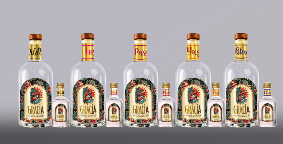
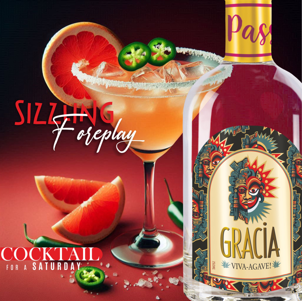
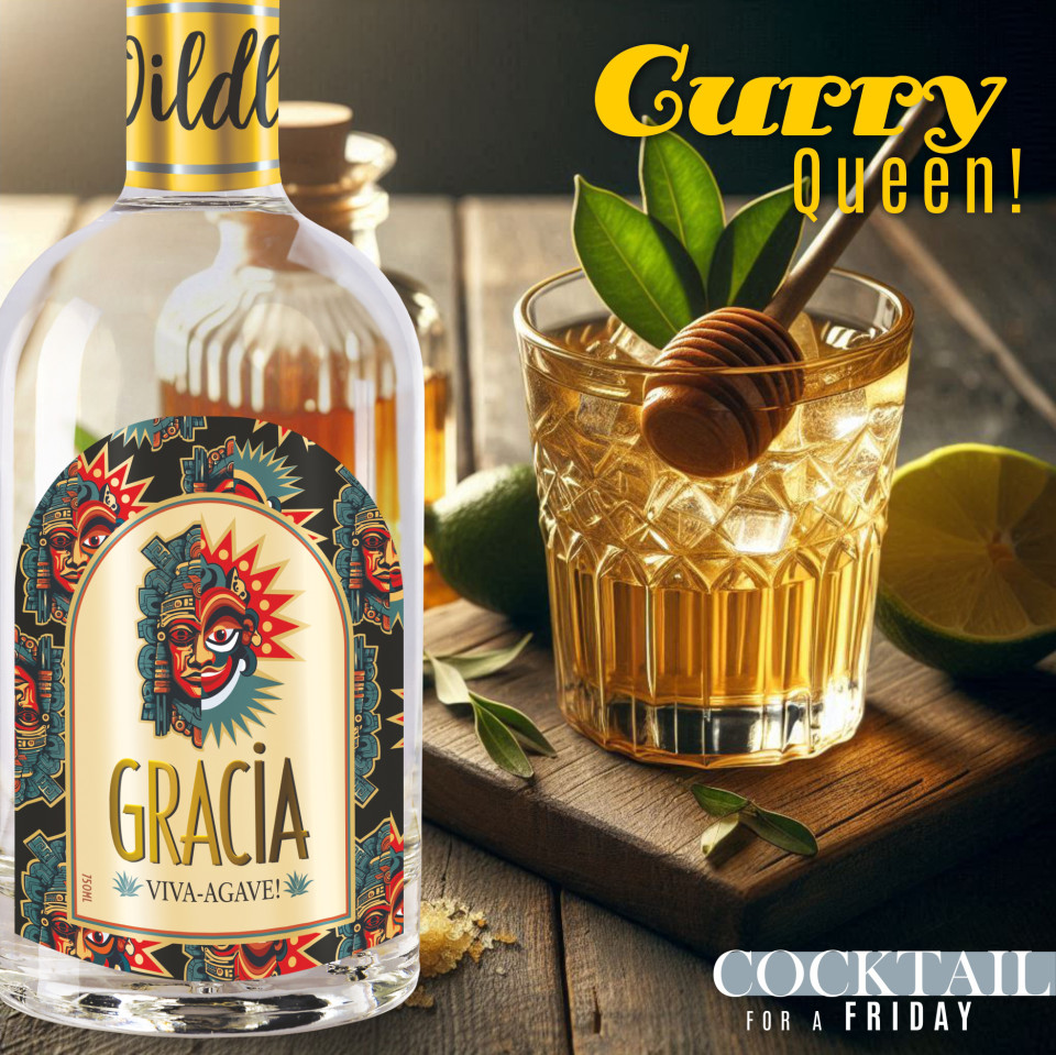
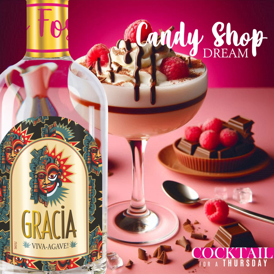
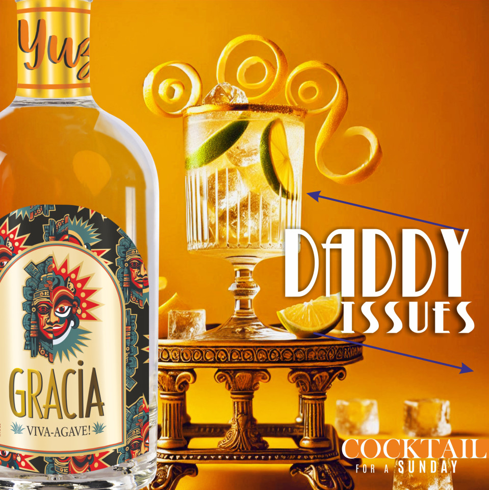
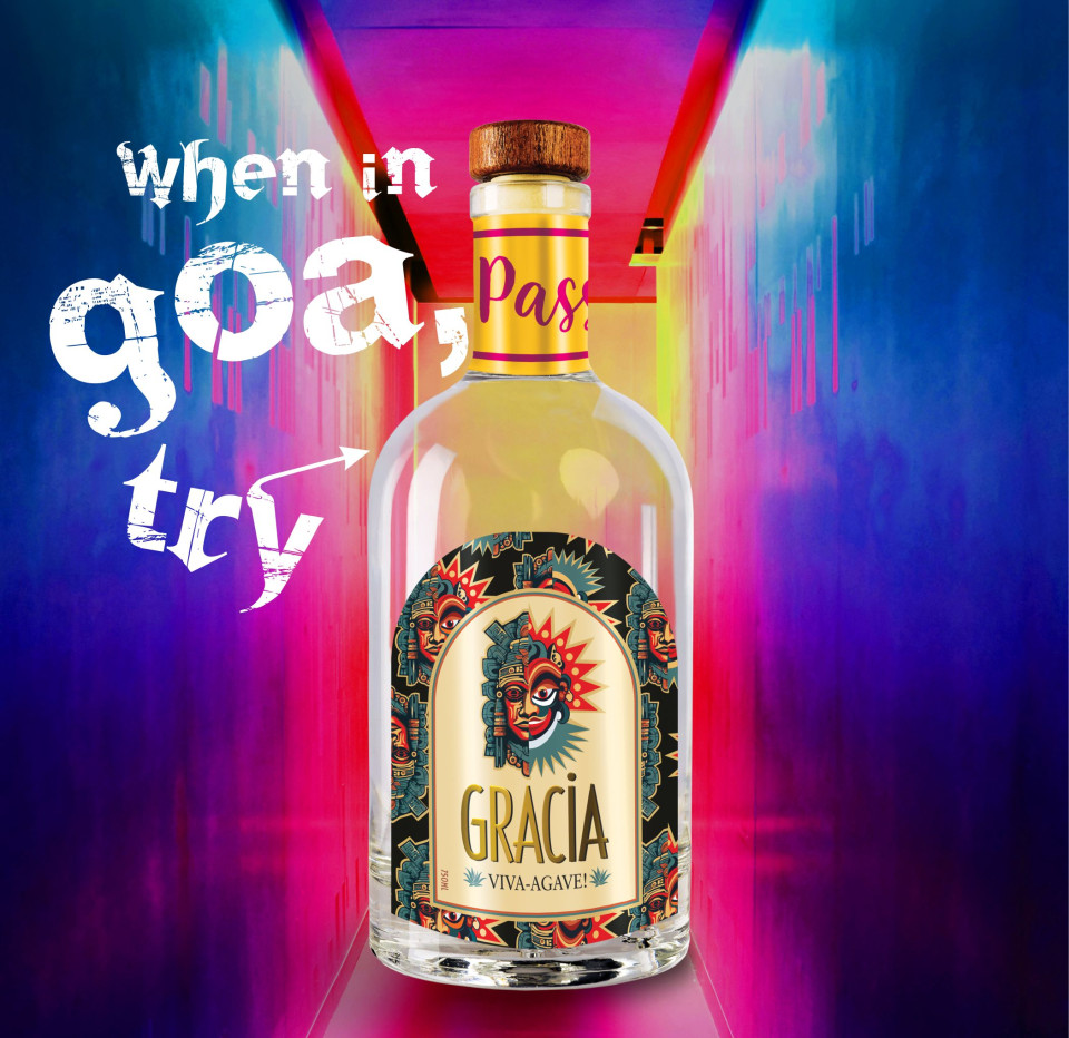
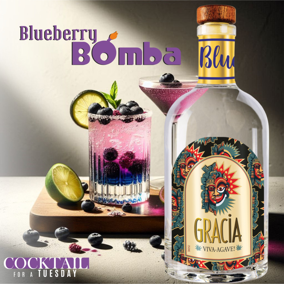
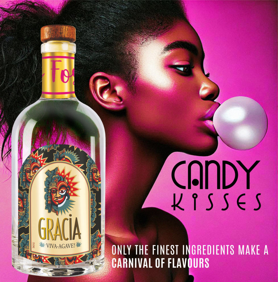
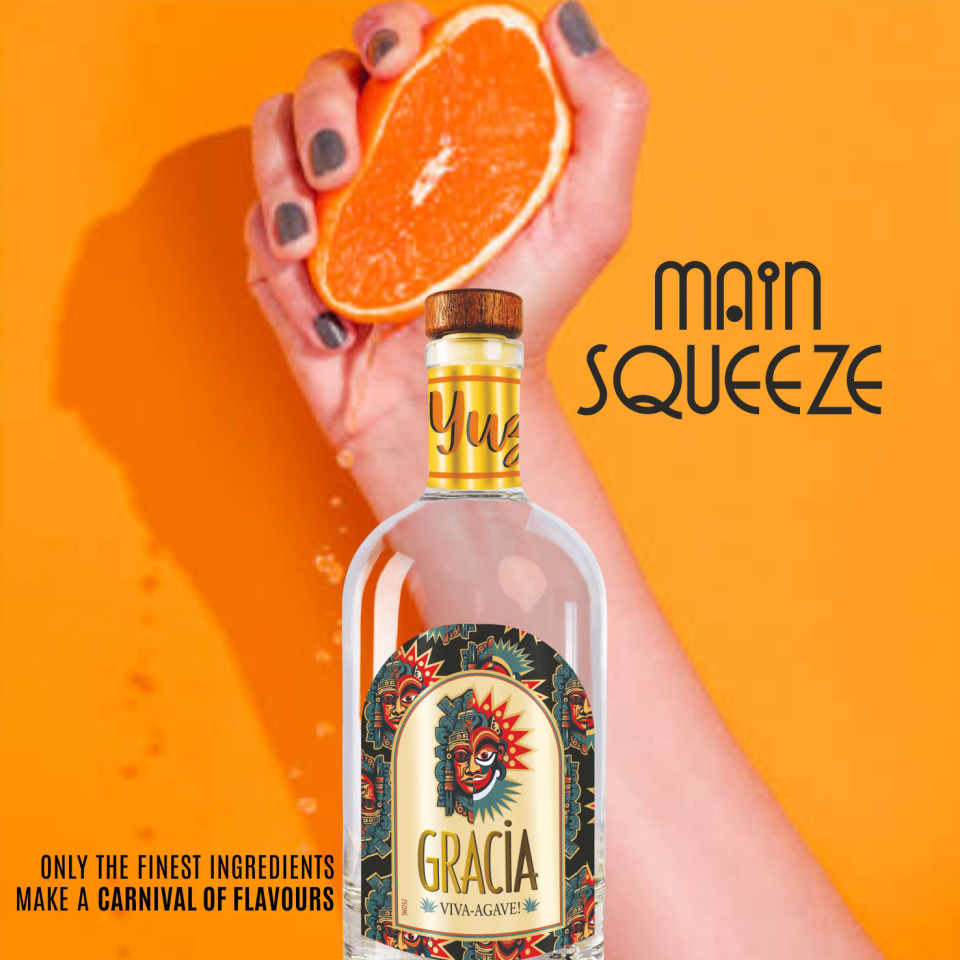
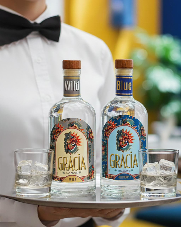
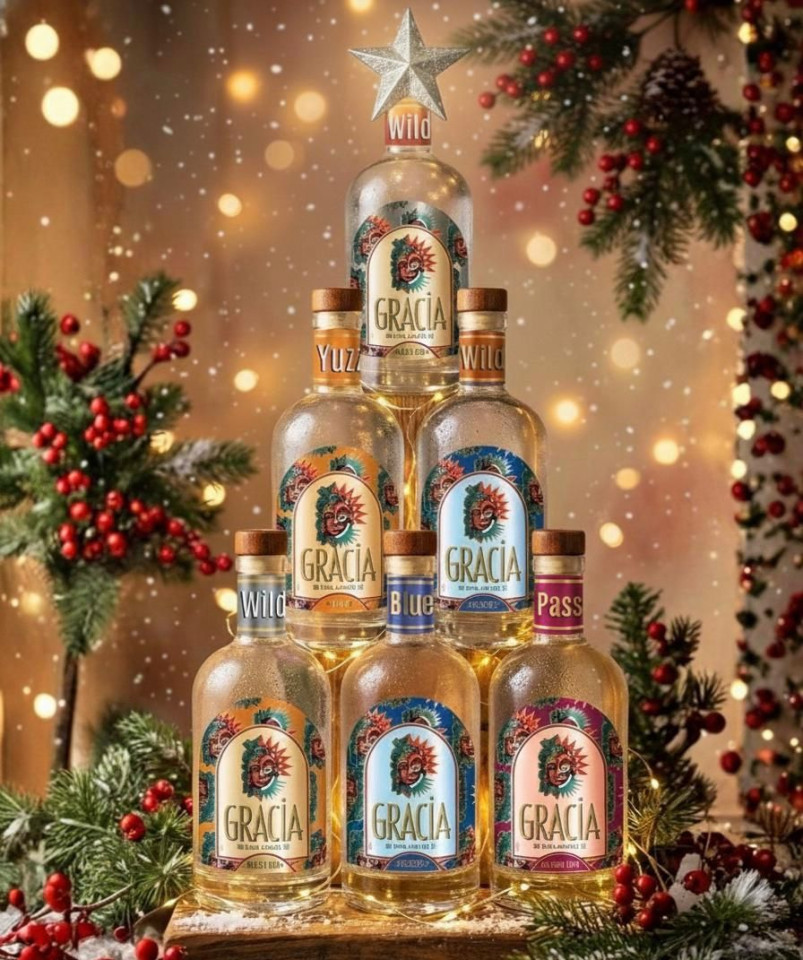
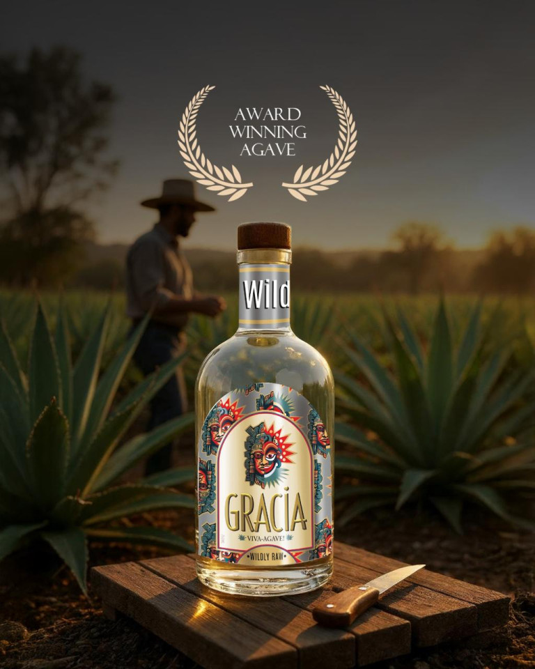
Gracia Viva Agave
Most of 2024 was spent in conceptualising a brand of Agave. Gracia Viva Agave is a homegrown, Goan Brand originally launched in Six Flavours.
From the name to the product design, labels, cartons to the launch event, ads, billboards, social media. This has been a challenging, but satisfying journey.


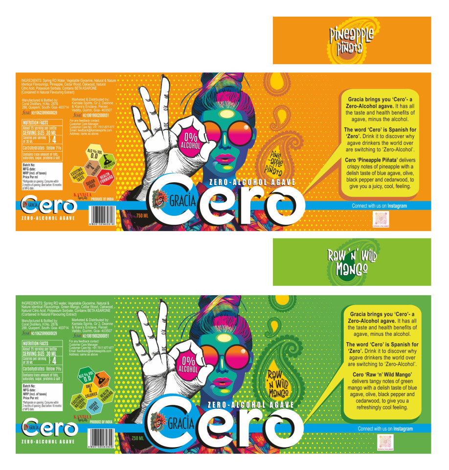
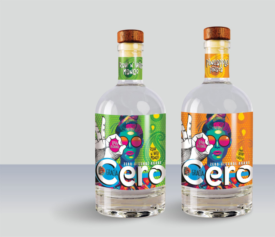
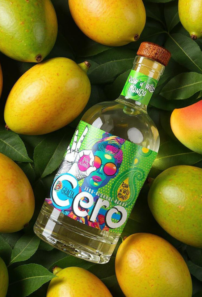
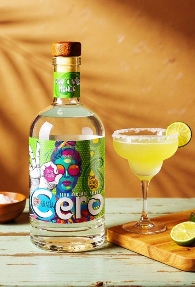
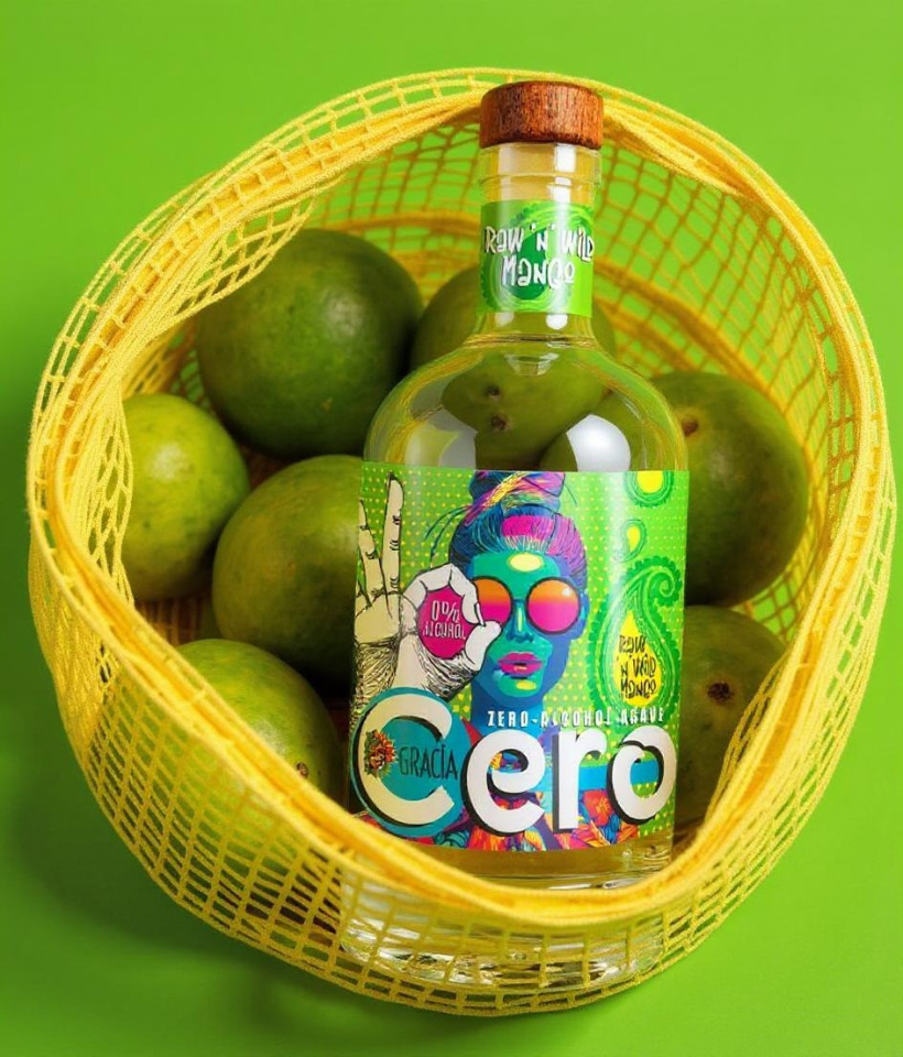
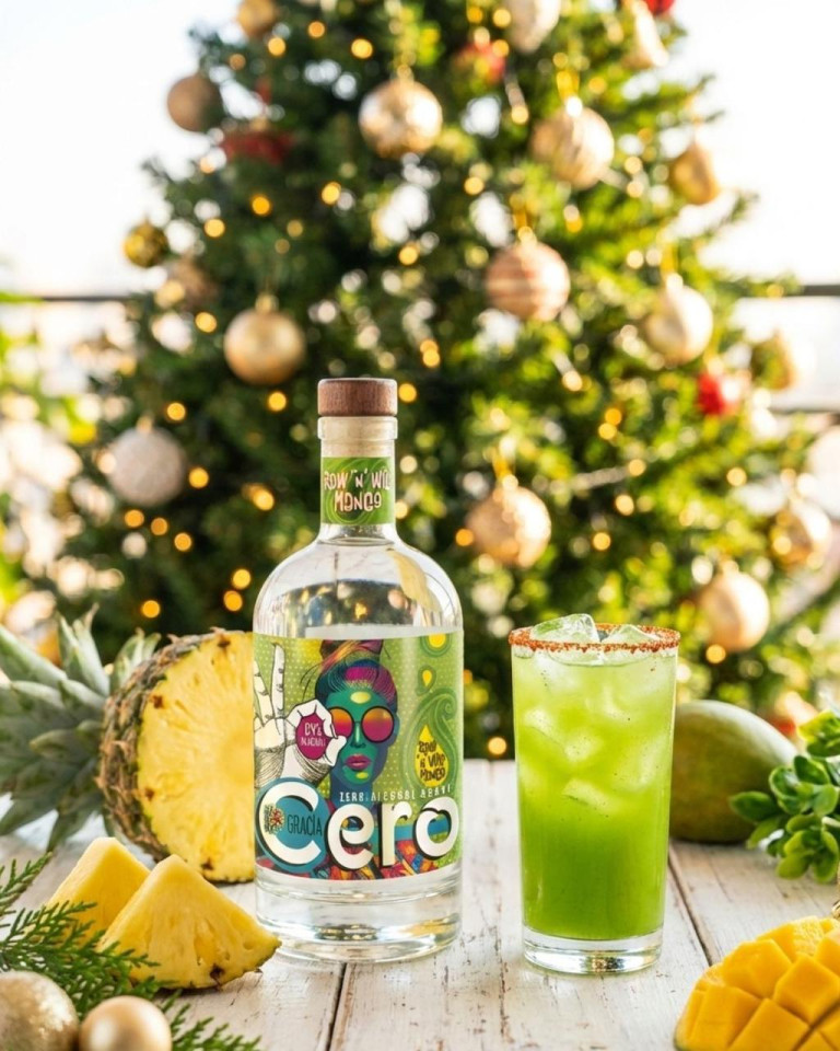
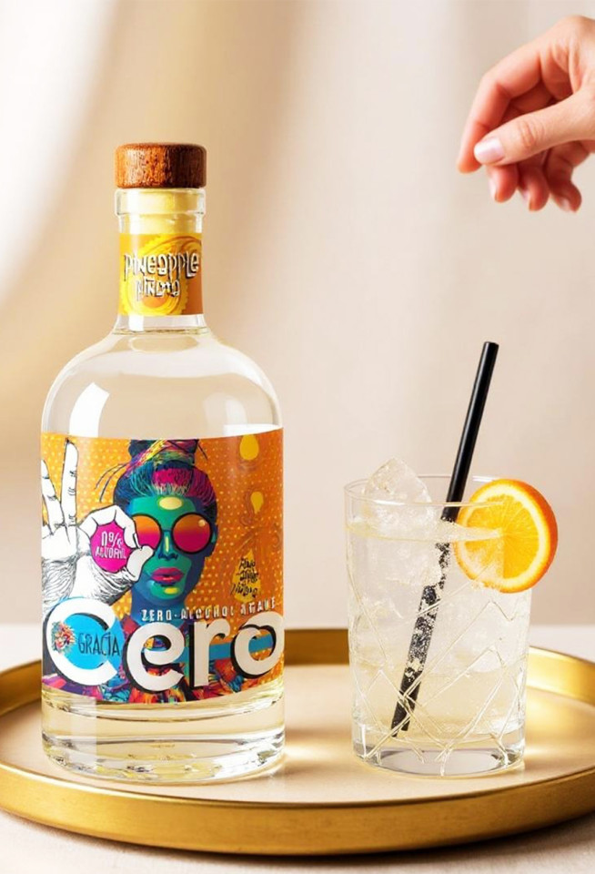
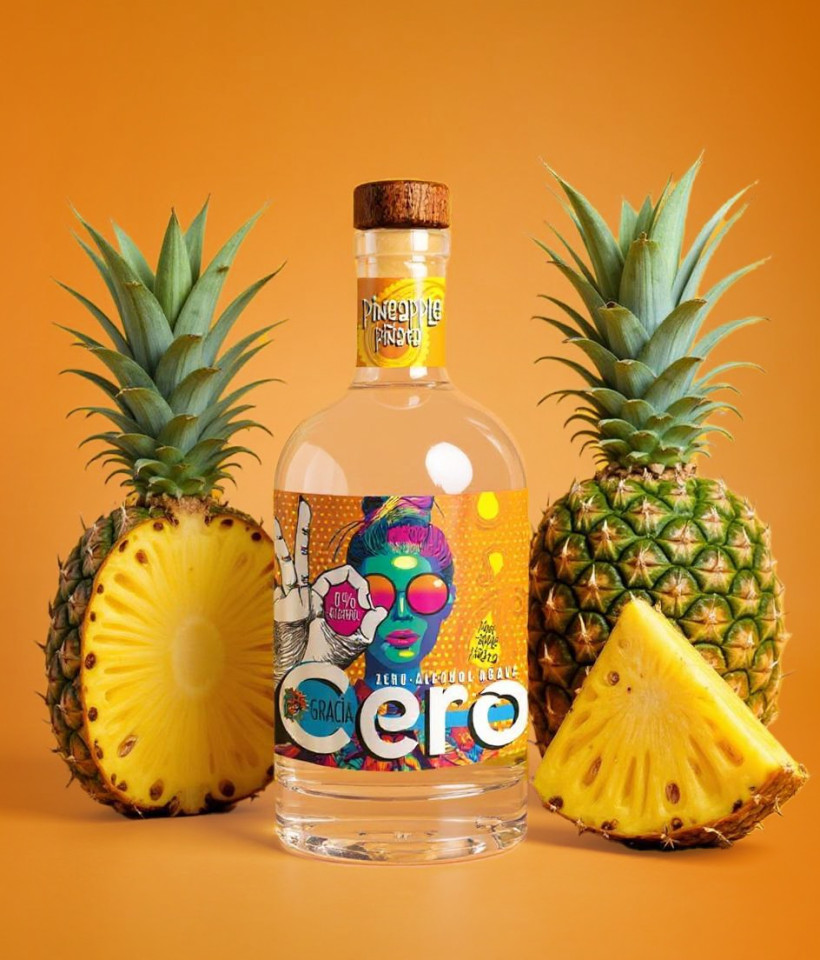
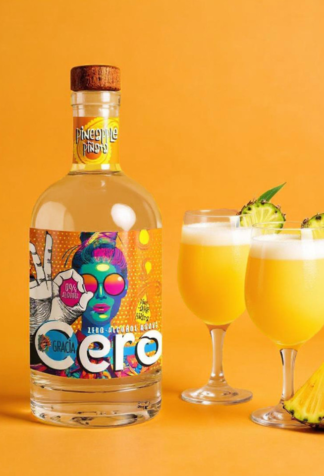
Gracia Cero Non Alcoholic Agave
This is a Zero-Alcohol Agave available in two flavors. The brief was to make it an attractive-looking drink so that teetotallers look cool, and feel cool buying/ drinking it. I have used colours and imagery that spell fun and health.
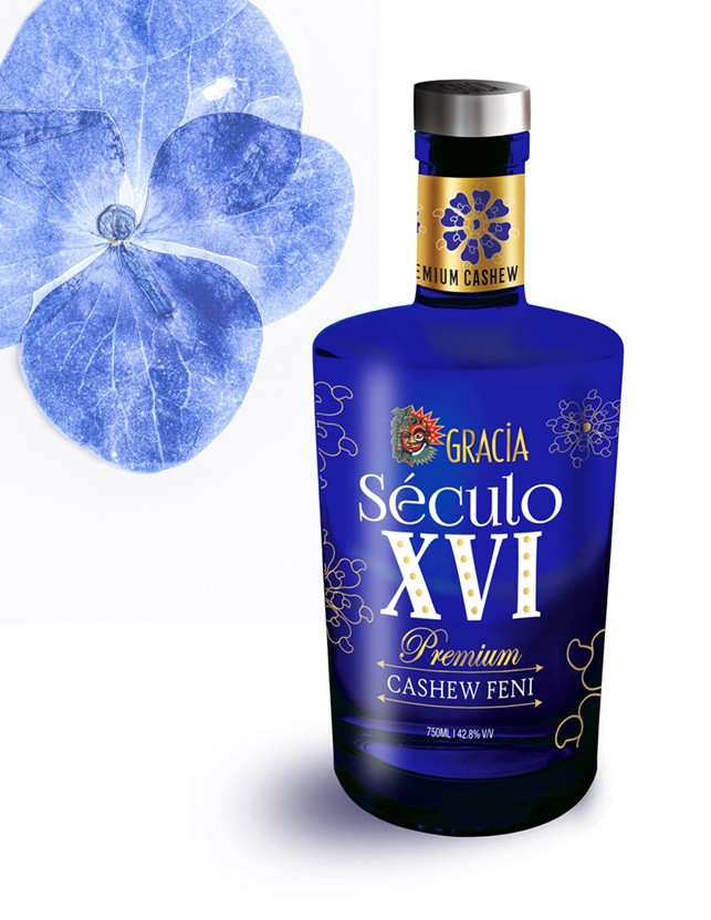
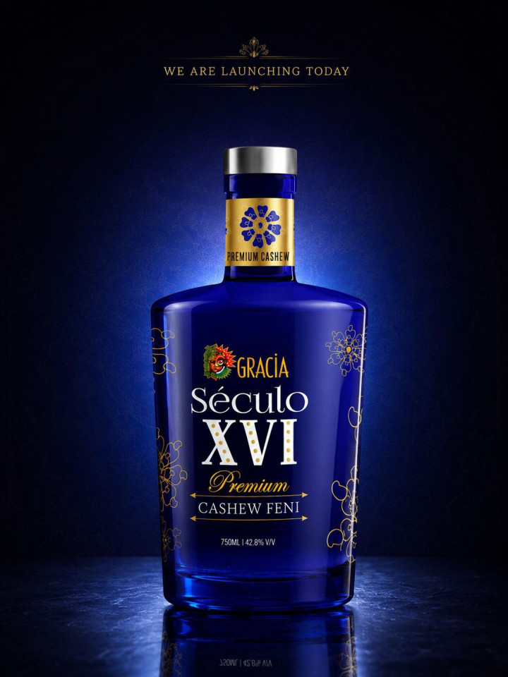
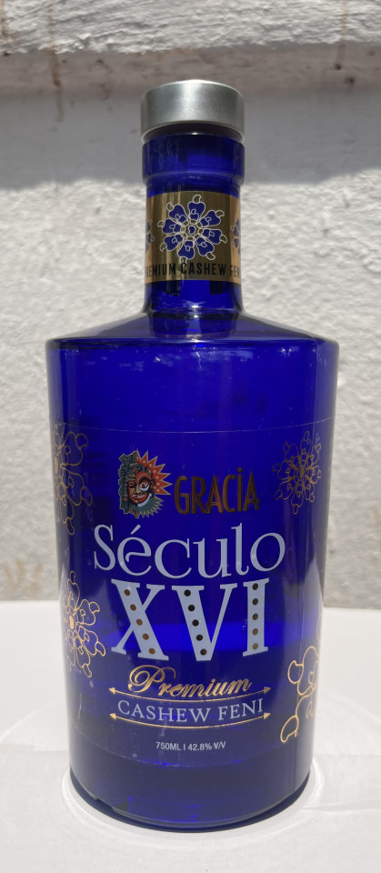
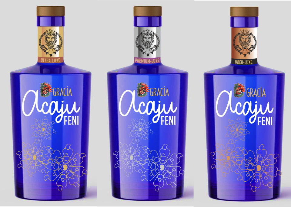
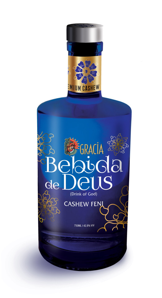
Gracia Século XVI
This packaging design was approved quickly, but then went though 2 name changes till excise finally approved Século XVI.
From Acaju premium feni to Bebida de Deus (drink of god)- Excise dept objected to use of 'god'!!! Século XVI means 16th Century in Portuguese- the century in which cashew crops were imported into Goa from Brazil, by Portuguese missionaries. Also the century in which Goans invented feni. The distillation process remains unchanged since then.
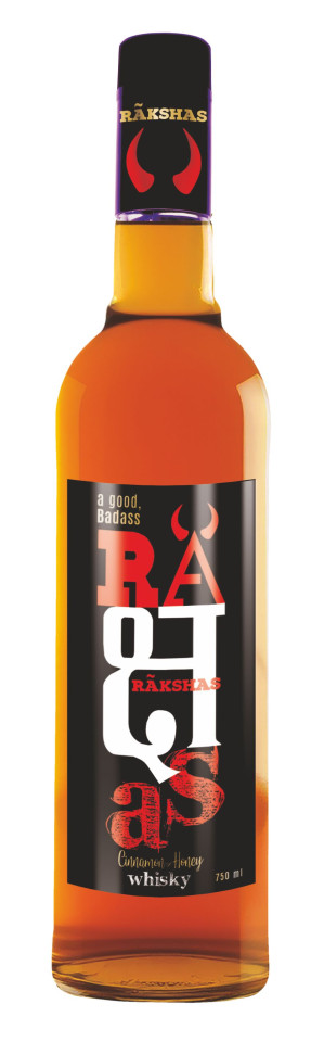
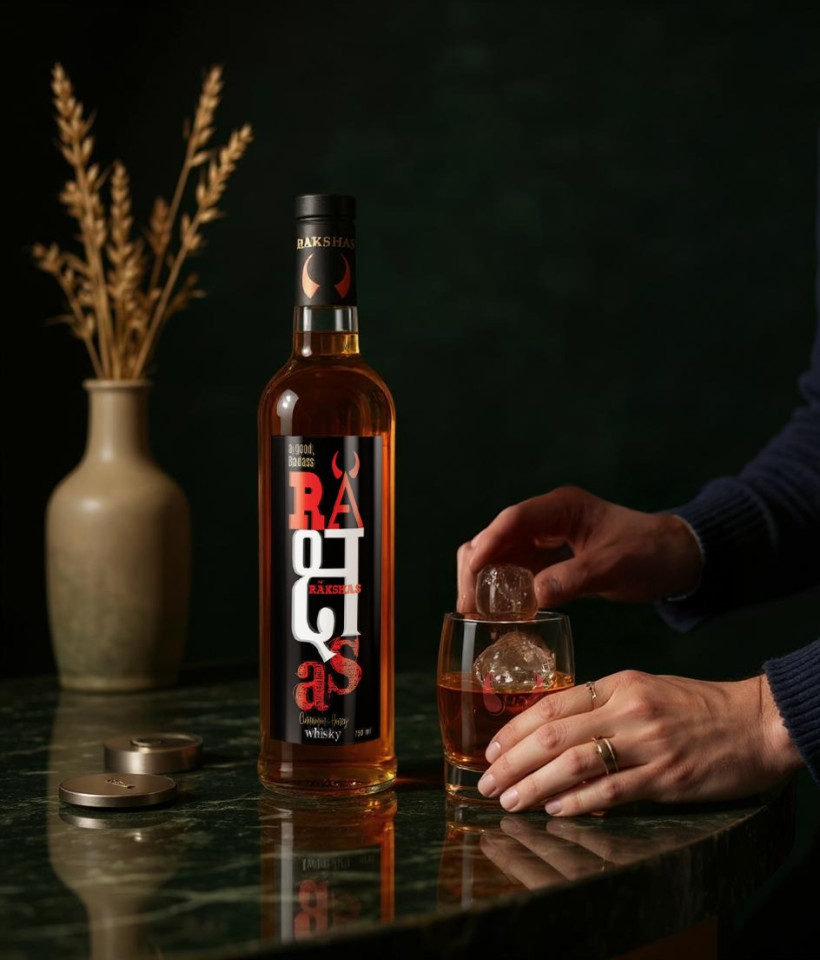
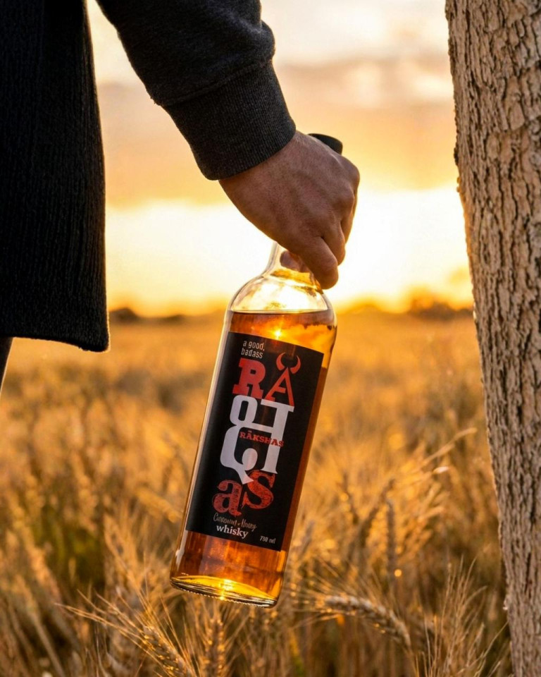
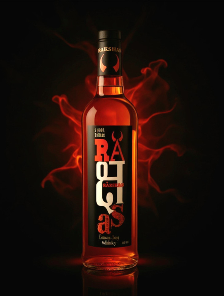
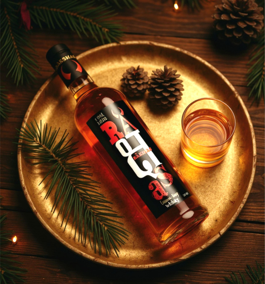
Rakshas Whisky
This is a fiery, cinnamon & honey - flavoured whisky. At a time when winestores were flush with several kinds of whiskies, I had the task of making this one stand out- by name and by design. Right from the start, after several discussions with the marketing team, I decided to use the billboard concept for a label design, so that it would register at first glance, in a few seconds. This led to simple colours- red, black and white, and unusual typography to arrest attention.


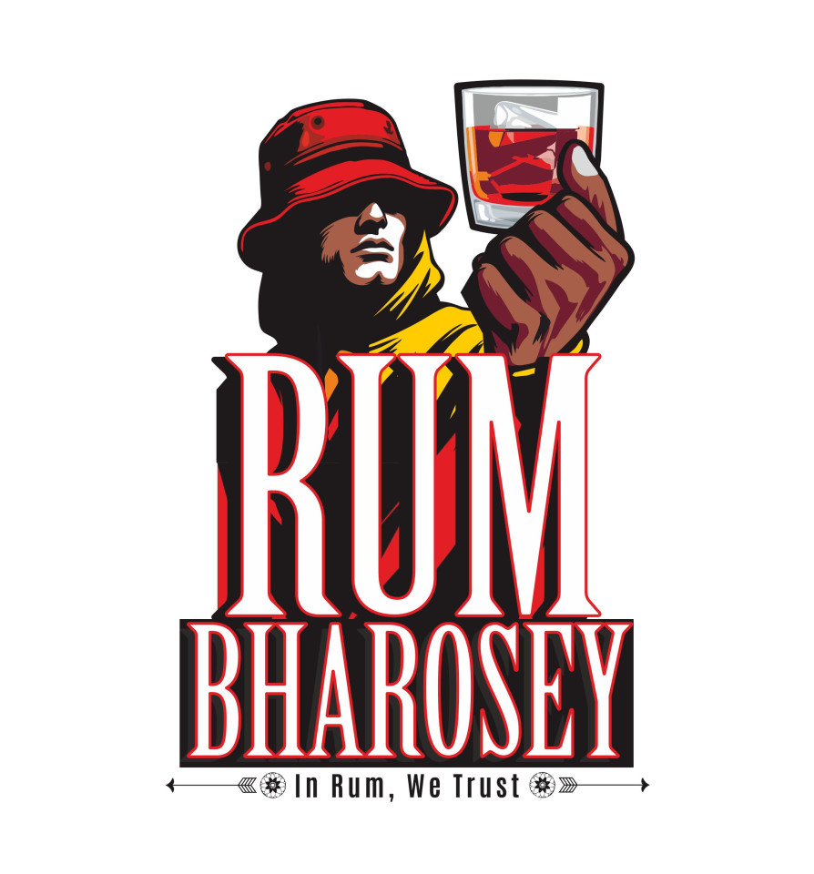
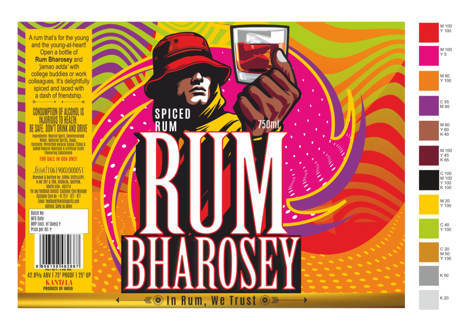
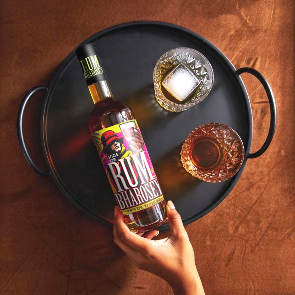
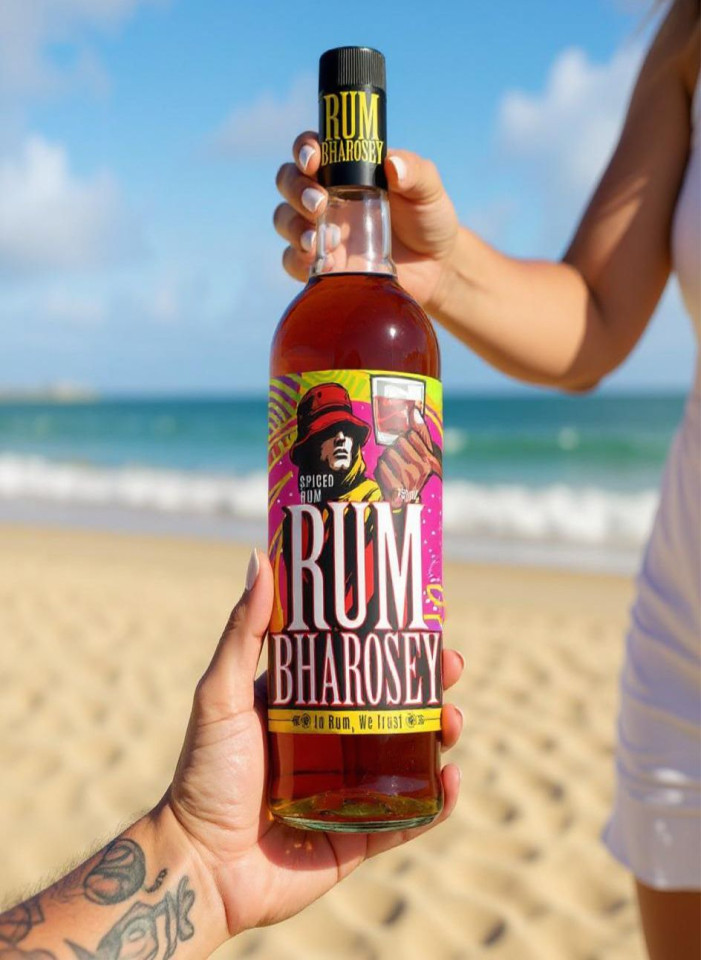
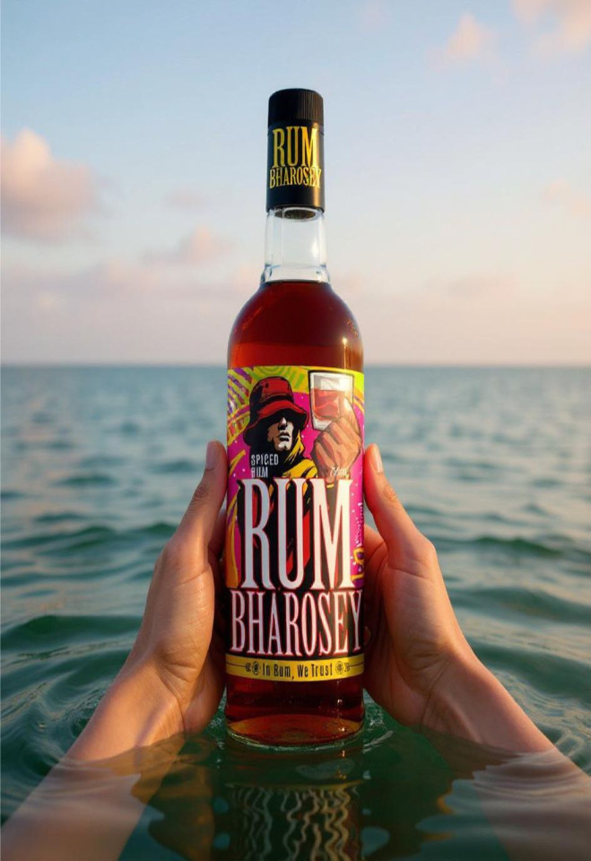
Rum Bharosey Spiced Rum
This packaging was so much fun, right from coining the name to designing the label. Promoted as every collegiate's first drink, or go-to drink during rock shows, and college socials, the label vibe is young, bright, and cheery.

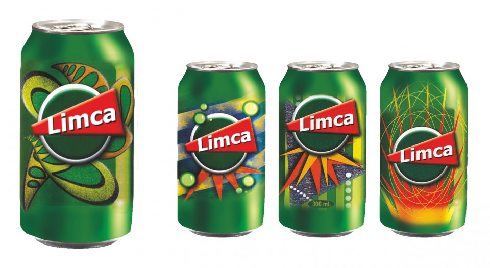
New Improved Limca
The Coca Cola Company tried very hard to kill Thums-Up, Limca and Gold-Spot when they bought Parle Drinks. They managed to kill Gold-Spot as it was an urban drink. Thums-Up and Limca had a stronghold over small town and rural India- that’s where the volumes are. So they tried the next best thing with these two invincible brands- revamp the look. Update the graphics, change the colours etc. But that didn’t work either...thank goodness! And I don’t mind at all that I have a portfolio full of ‘New Improved Limca’ packaging that did not see the light of the day...I love the way Limca has always looked. I worked on Limca while at Leo Burnett.
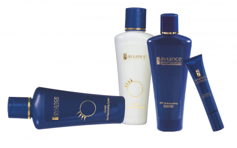
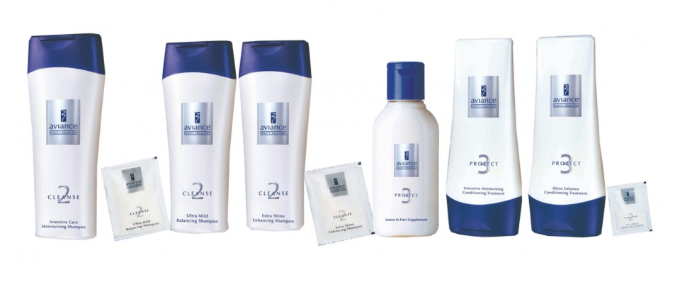
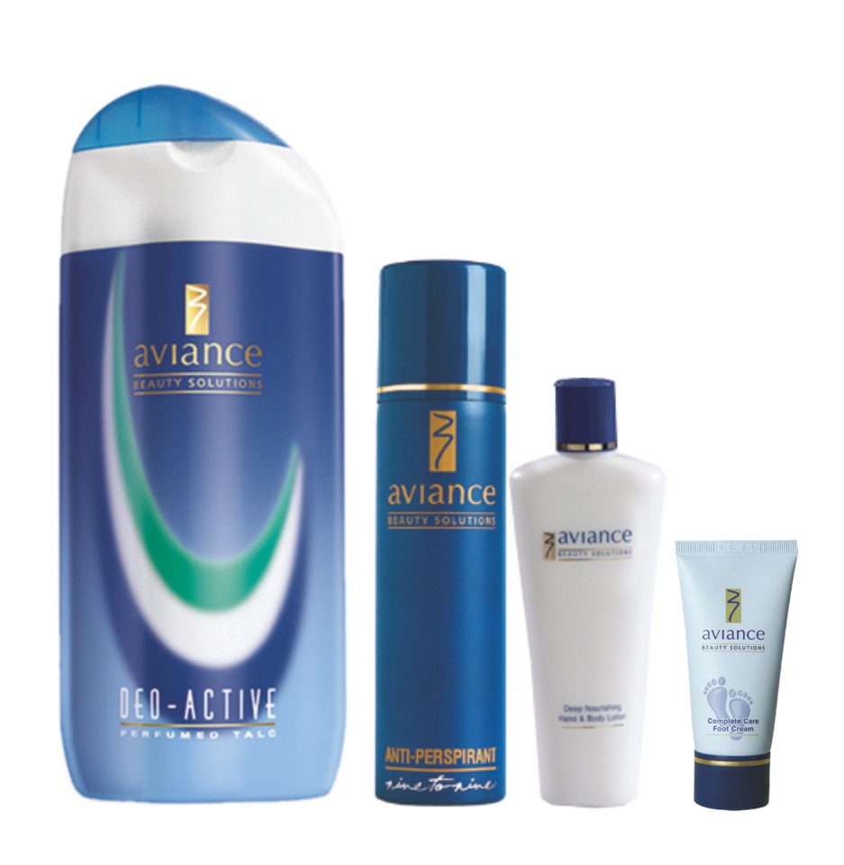
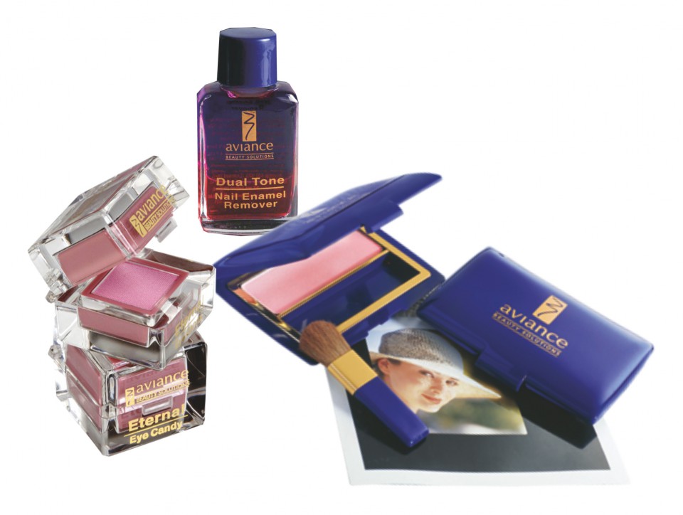
Aviance
Product designs for a brand of premium cosmetics and skincare from HLL
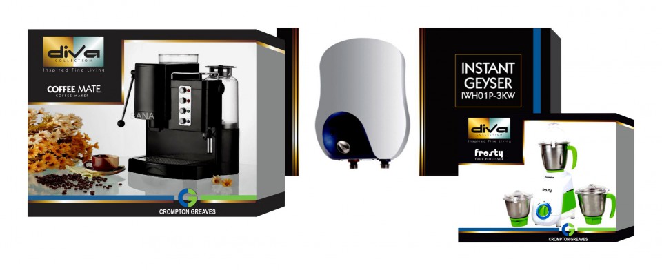
Diva Collection
A packaging pitch assignment for Crompton Greaves Appliances.
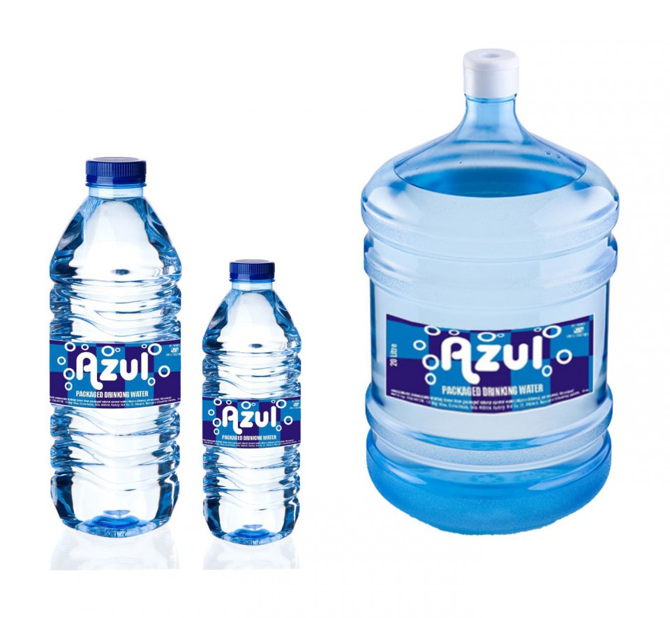
Azul Mineral Water
A South Goa brand of mineral water.